Fluent Theme
Introduction
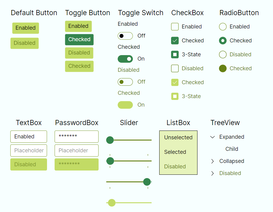
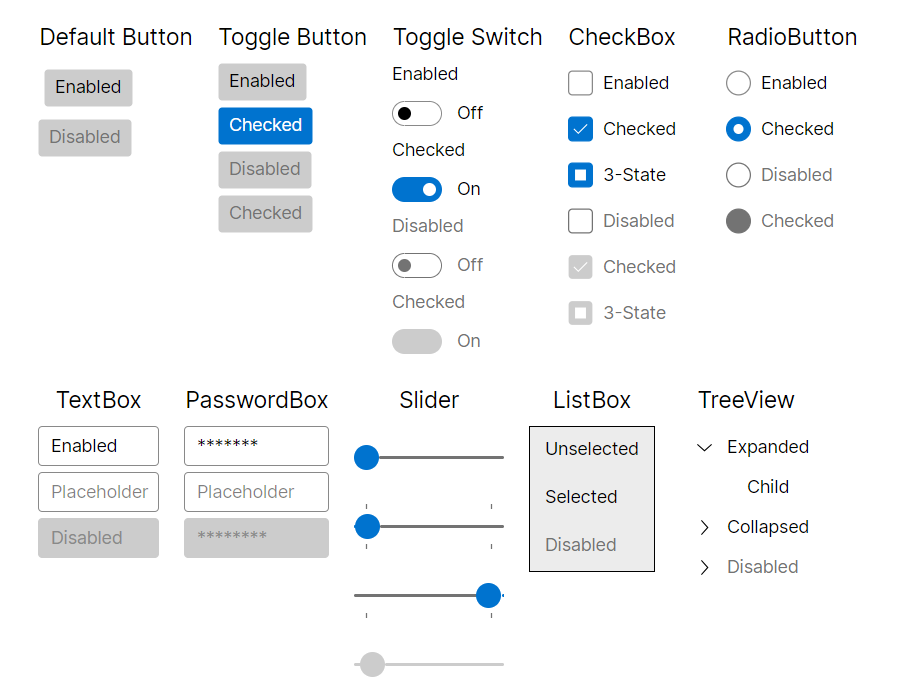
Avalonia Fluent theme is inspired by Microsoft's Fluent Design System, which is a set of design guidelines and components for creating visually appealing and interactive user interfaces. The Fluent Design System emphasizes modern, clean aesthetics, smooth animations, and intuitive interactions. It provides a consistent and polished look-and-feel across different platforms, while giving developers flexibility with our styling system.
How to use
As a first step, Avalonia.Themes.Fluent nuget package needs to be installed.
On how to add a nuget package, you can follow steps from the Nuget page or Visual Studio, Rider documentation.
After that theme needs to be included in the Application class:
<Application xmlns="https://github.com/avaloniaui"
             xmlns:x="http://schemas.microsoft.com/winfx/2006/xaml"
             x:Class="AvaloniaApplication.App">
  <Application.Styles>
    <FluentTheme />
  </Application.Styles>
</Application>
If you need to specify theme dark or light variant, please follow Theme Variants documentation.
Changing theme density
Fluent theme has two sets of predefined density variants. To switch to more compact look, you can set it with DensityStyle property:
<Application xmlns="https://github.com/avaloniaui"
             xmlns:x="http://schemas.microsoft.com/winfx/2006/xaml"
             x:Class="AvaloniaApplication.App">
  <Application.Styles>
    <FluentTheme DensityStyle="Compact" />
  </Application.Styles>
</Application>
Creating custom color palettes